PACKAGING DESIGN
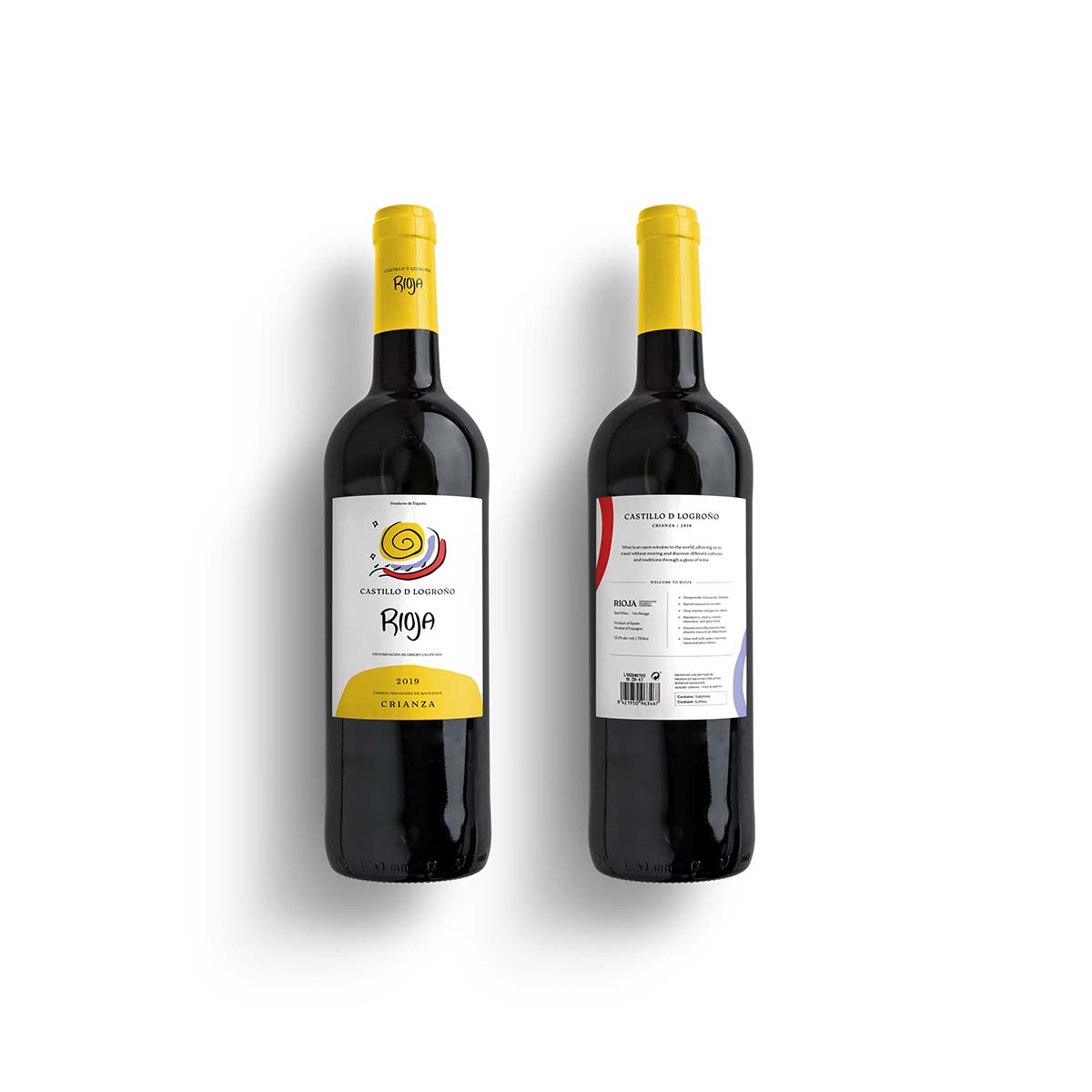
Castillo de Logrono Wine Bottle Redesign
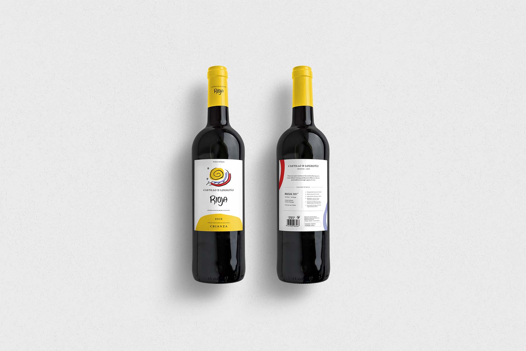
Castillo de Logrono is a Spanish wine brand from the central plains of Spain. Using style influences from prominent Spanish artists like Joan Miro and Picasso, this project rebranded the Rioja to reflect the Spanish culture and heritage that this wine represents.
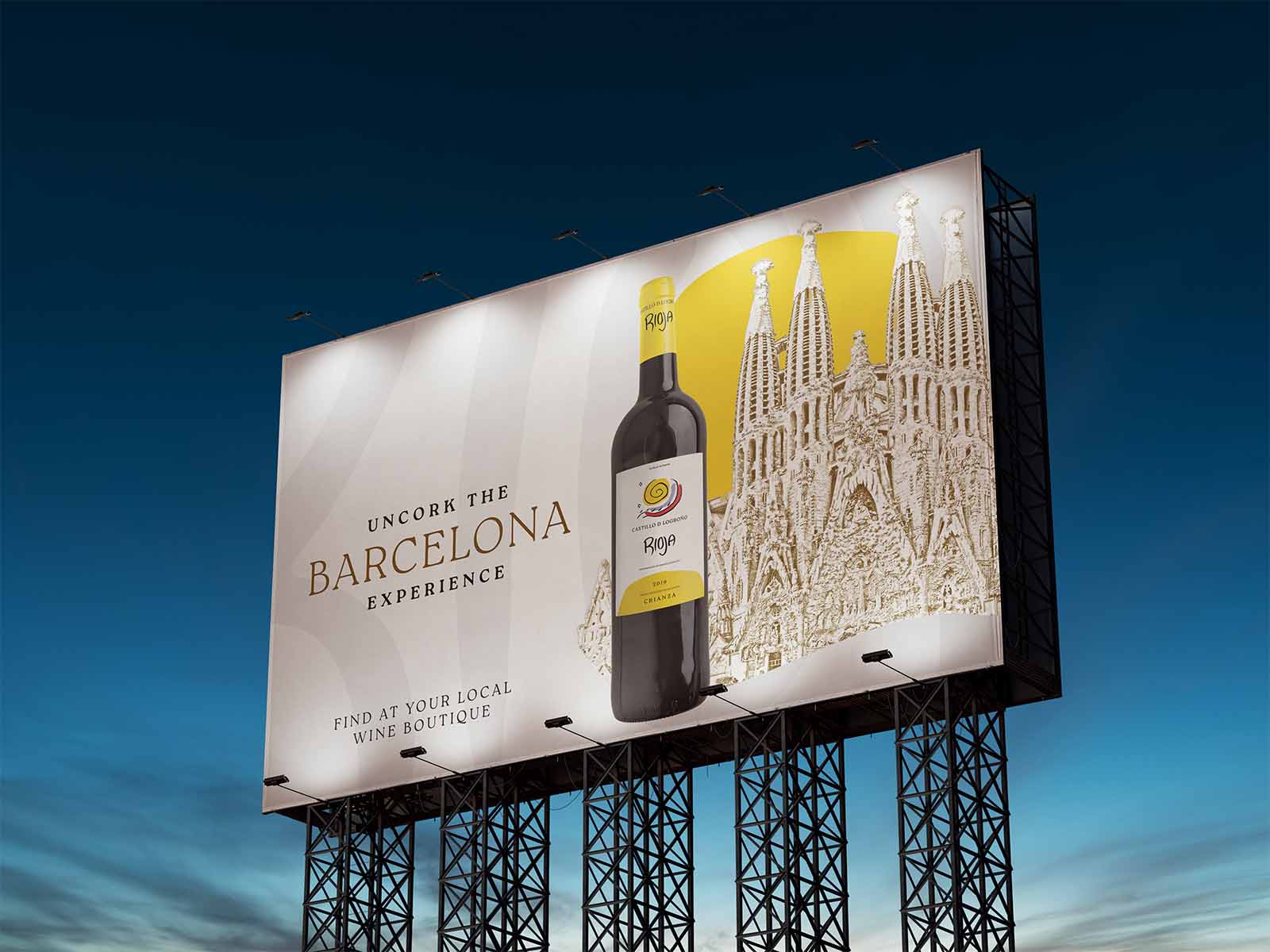
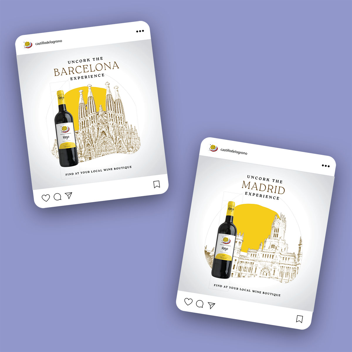
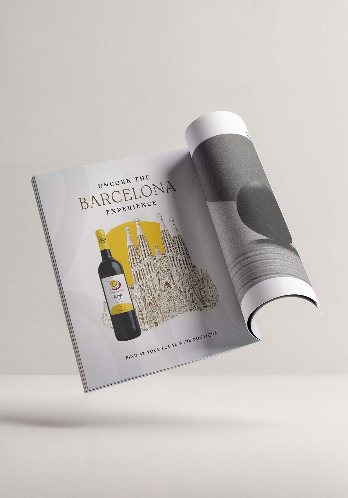
User research showed that the target market for this wine were cultured young professionals with a passion for travel. While sometimes working on a limited budget, this branding appeals to their wanderlust, transporting you to Spain with each sip.
Project Process
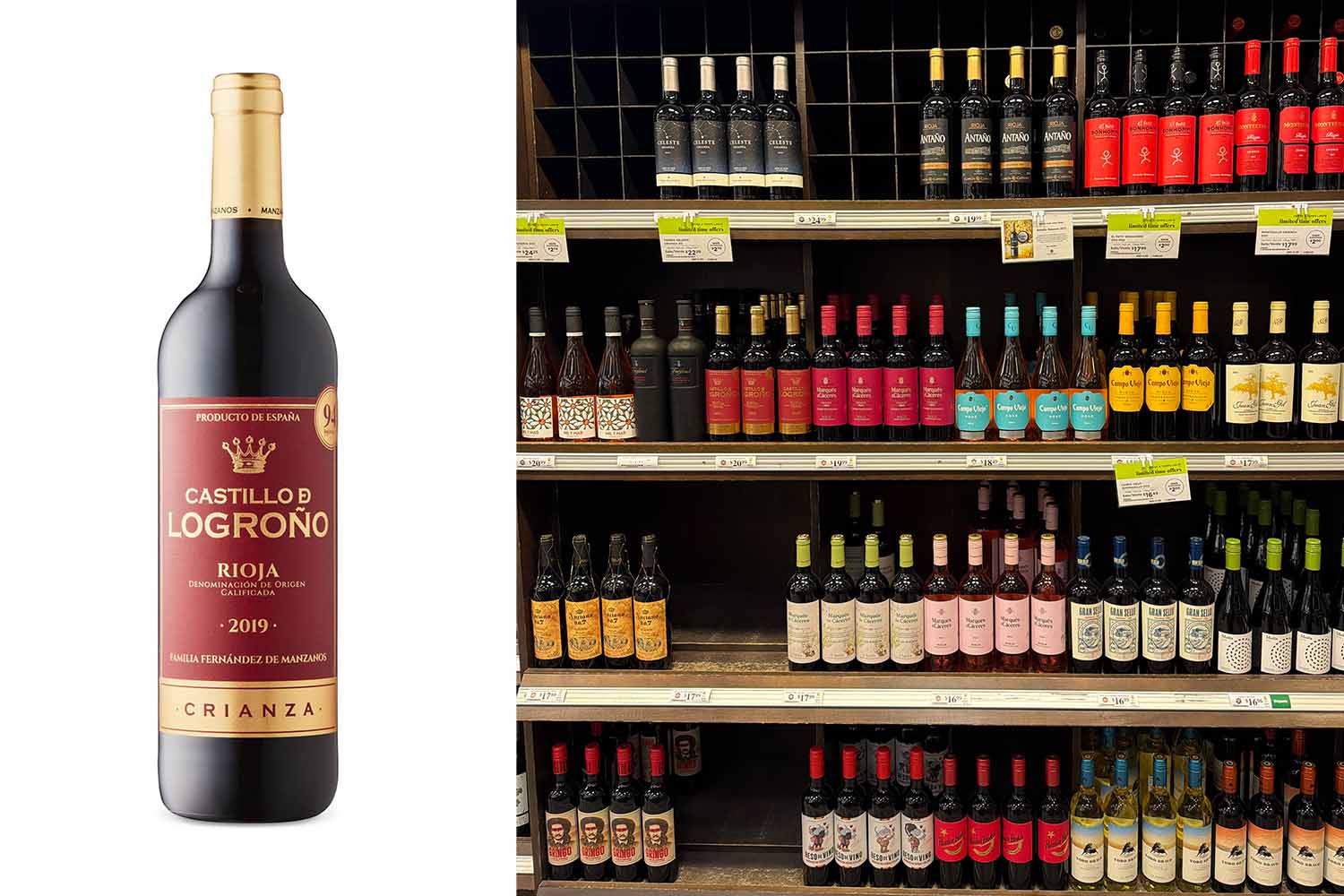
The existing wine label features red and gold, a common combination with competitors. It also makes use of serif fonts and borders, both frequently featured on competitor labels. The redesign will focus on differentiating the wine from competitors and appealing more to the target audience’s aesthetic preferences.
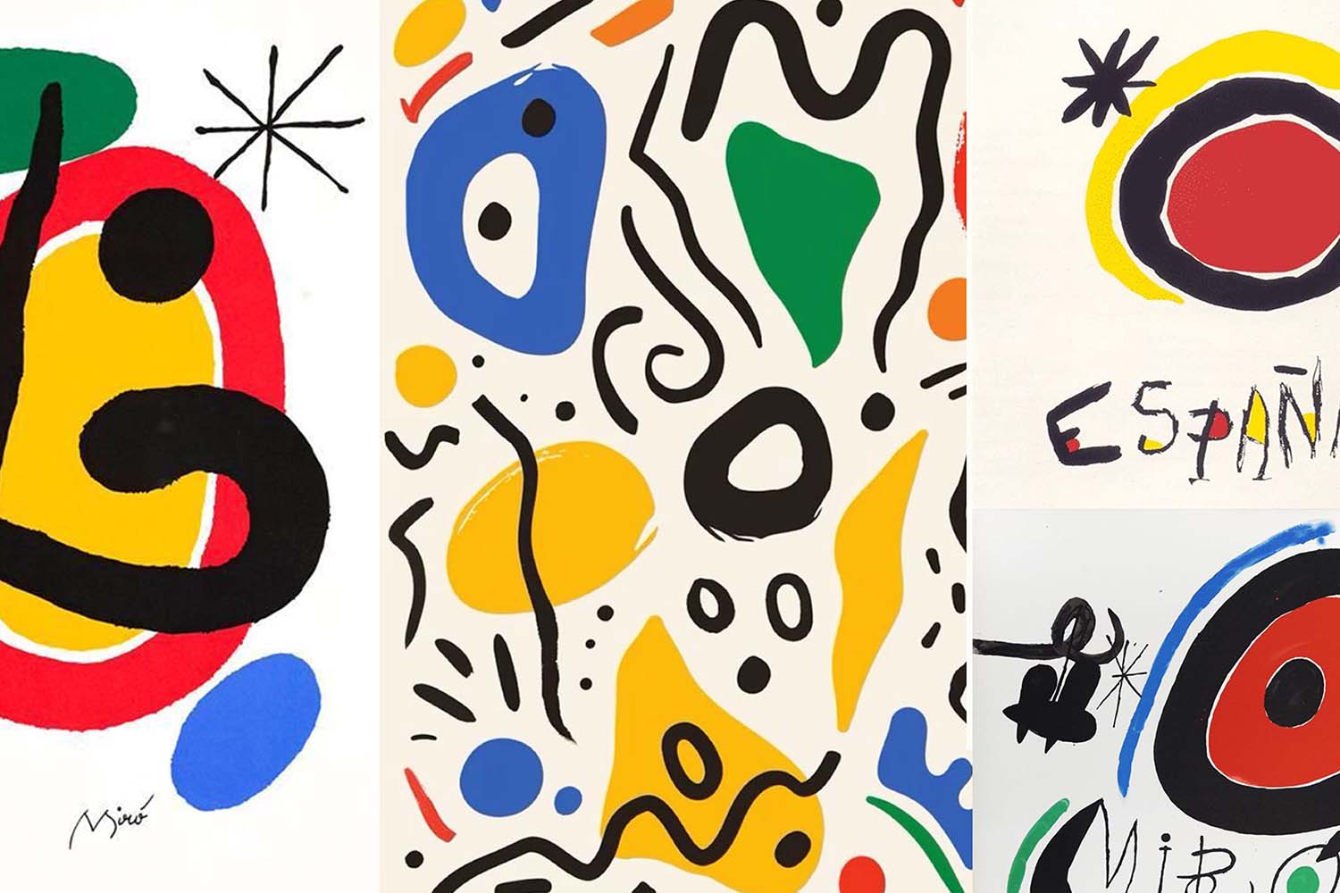
Early exploration and research developed a concept informed on Spanish modern artists. This was based on the target audience's interest in the arts and culture sector. Joan Miro, Pablo Picasso and others informed the concept development.
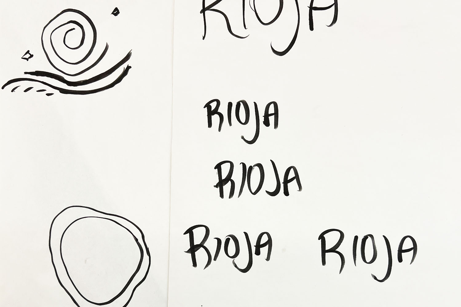
Exploration with a calligraphy brush marker allowed for a hand rendered title for the wine. This built on the connection to Joan Miro and others and provided a visual tool that is quite different from competitor wines.
Campaign Expressions