EDITORIAL
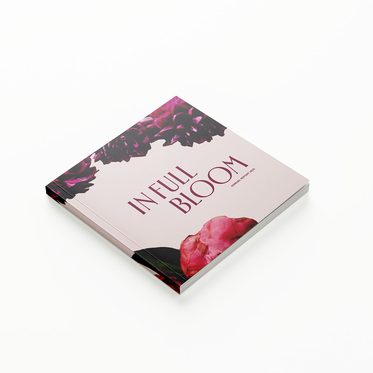
Petal & Stem Annual Report: In Full Bloom
Petal & Stem is imagined as an industry leader in the plant and flower delivery service market. They are outperforming the previous year and aiming to expand their business from a national Canadian operation to an international brand.
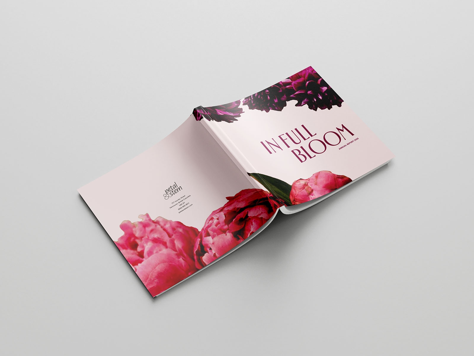
This design solution represents this growth and flourishing through the theme In Full Bloom. It demonstrates to investors and possible investors that Petal & Stem are a strong and healthy business worth investing in.
In Full Bloom speaks to the position of Petal & Stem as a growing and flourishing brand, while also reinforcing one of the primary services they offer. This repeated motif demonstrates how Petal & Stem is not simply flourishing financially, but also in many other areas of the organization.
Project Assets
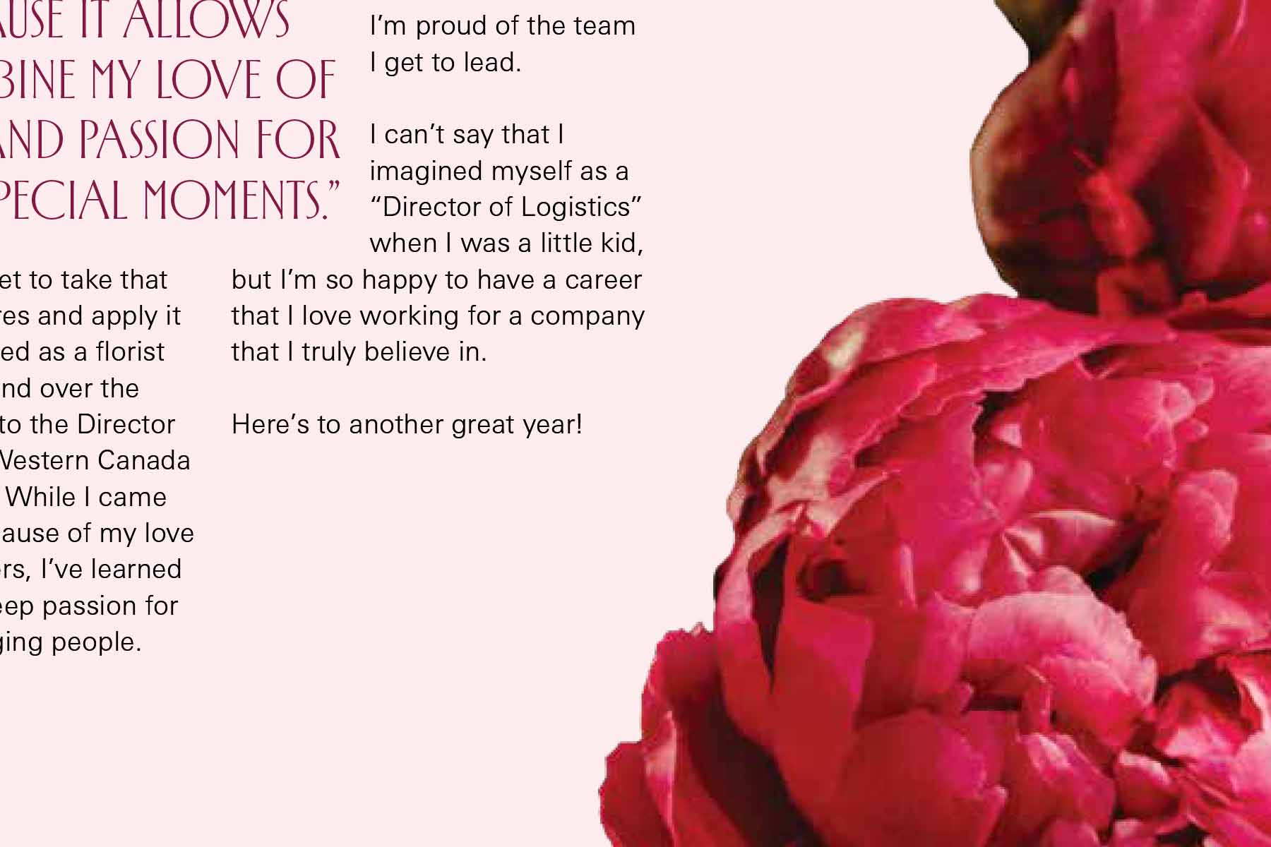
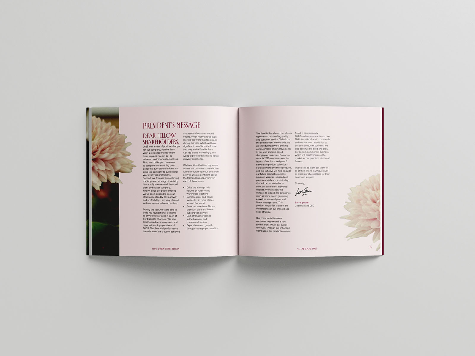
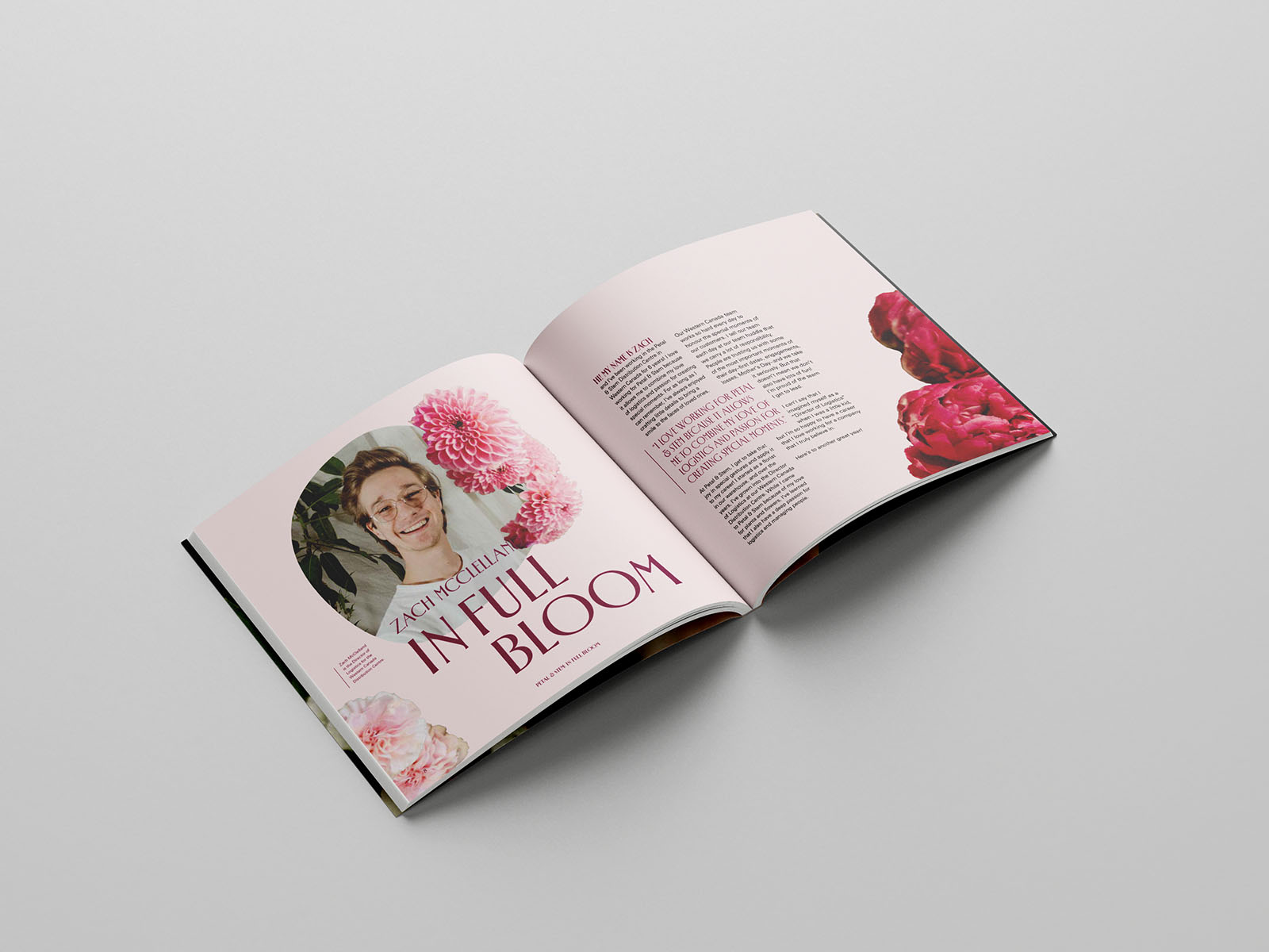
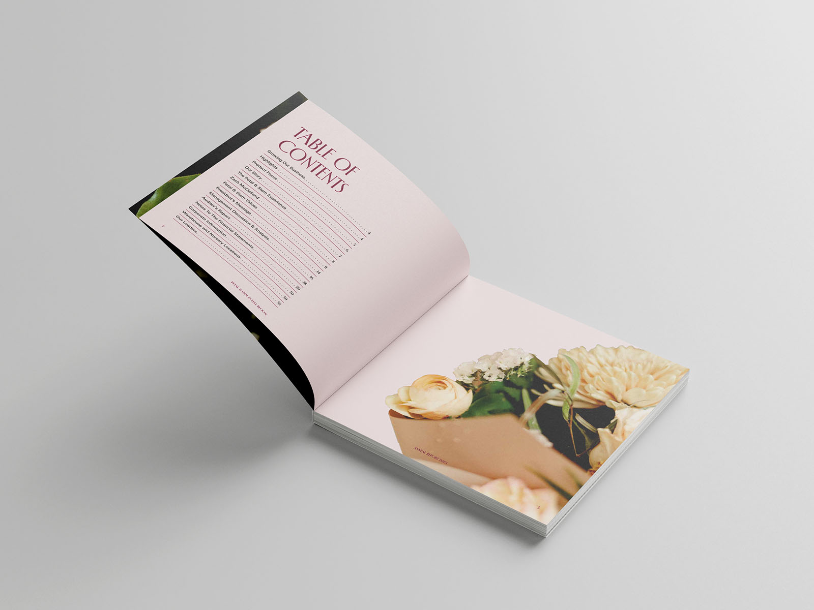
Large, close-cropped flowers occupy large portions of the perimeters of the pages, framing the content and reinforcing the repeated message “in full bloom.
The slightly pink background further integrates the florals into the design, while the square format offers a sense of sophistication and elegance, well-suited to Petal & Stem's reputation.
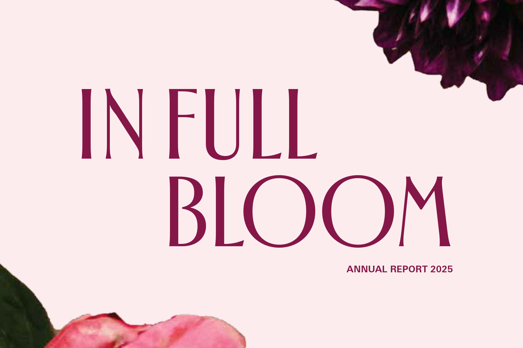
The font Spalla is used as the display font. Inspired by mid-century typography, this elegant font offers a sense of history to an organization celebrating their history and how that history is the foundation for their continued growth.
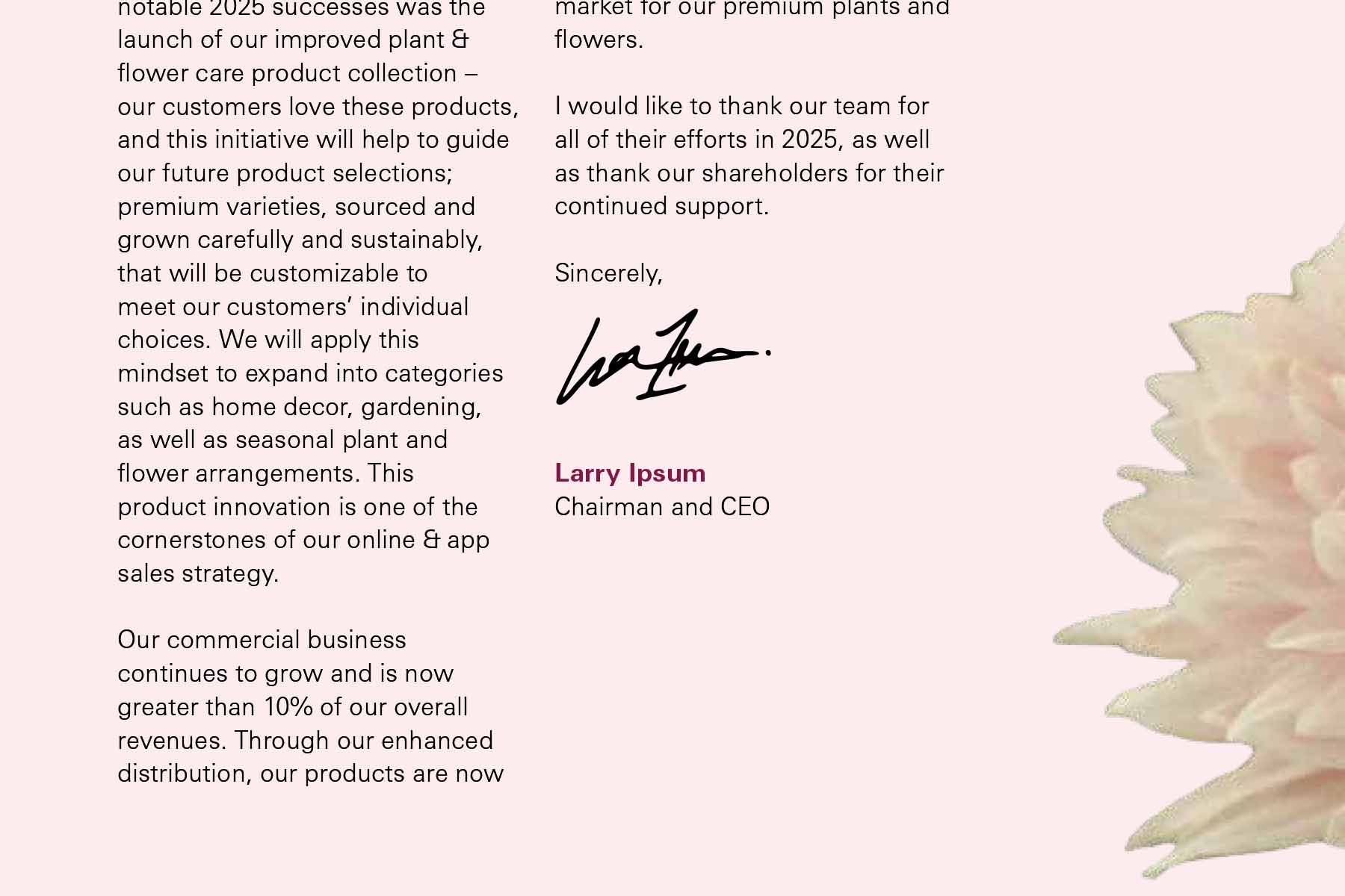
Univers Next Pro is used as the body font, offering a clean open font that balances the decorative and highly stylized Spalla. Univers also offers a subtle sense of history to the trained eye, as it also originates in the mid-century era.
Campaign Expressions