INTERACTION DESIGN
Archie App: Taking Petsitting to the Next Level
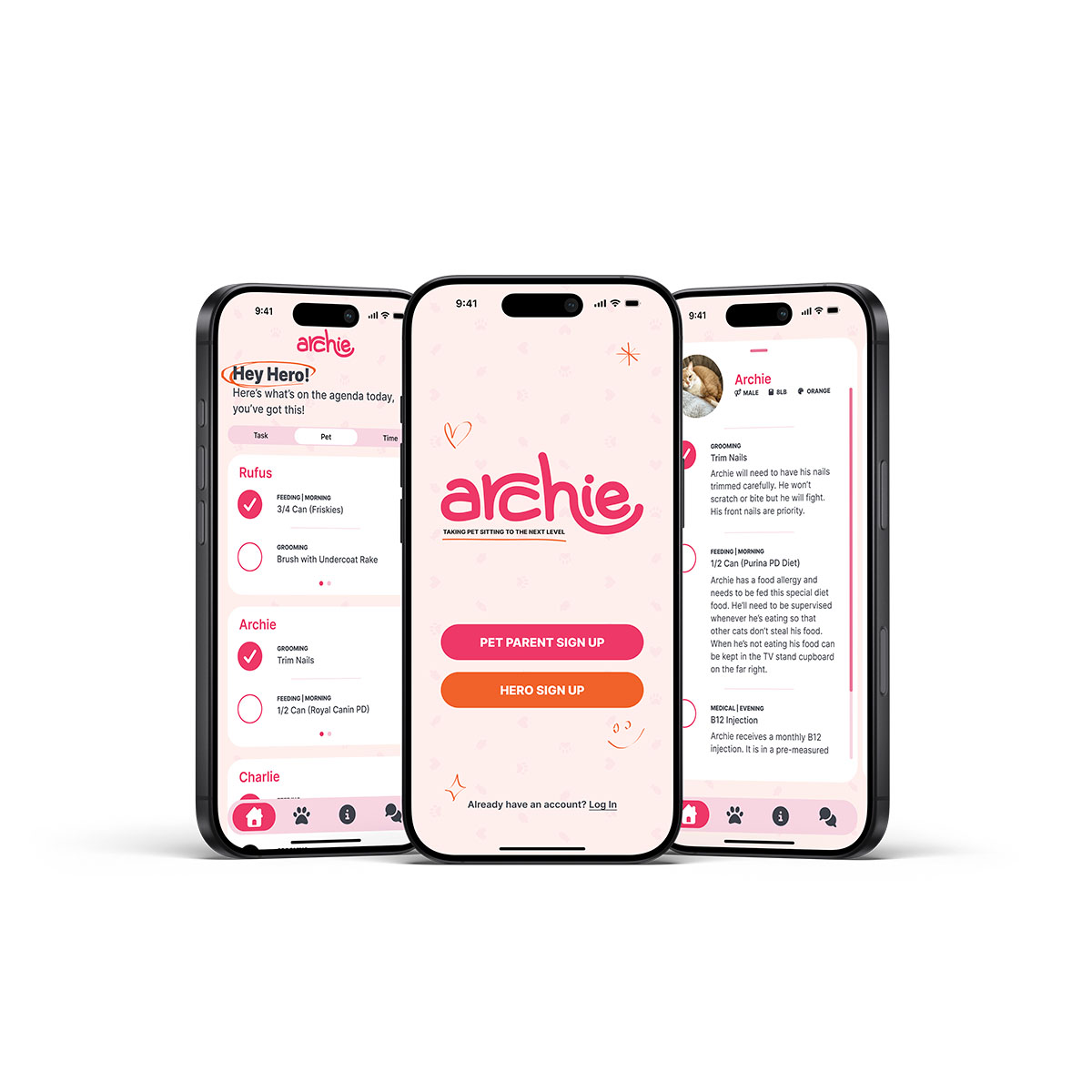
Archie is an app designed to equip pet sitters with all the resources needed to care for the pets in their care. Archie offers Pet Parents with high standards of care an opportunity to equip their pet sitters (called Heroes) with detailed and specific care instructions unique to each animal.
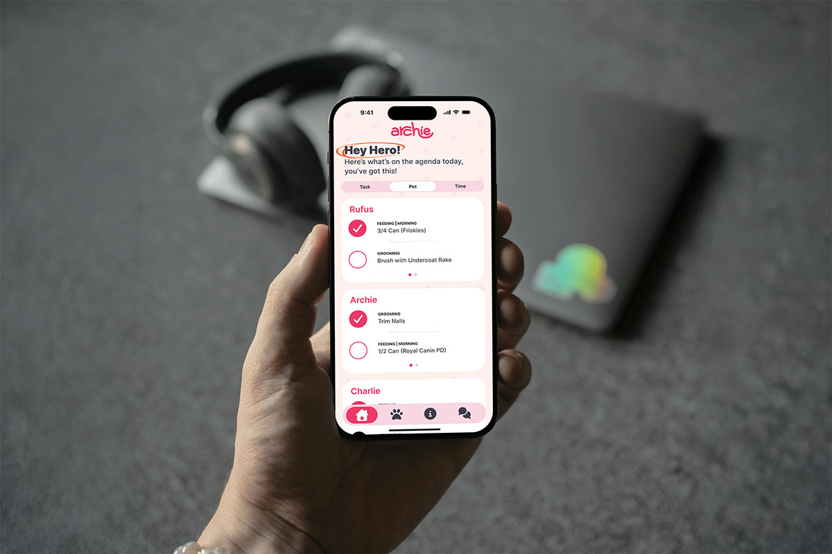
Aggregate to-do lists, detailed task notes, individual pet profiles and our chat and animal FAQ features create a robust offering for meticulous Pet Parents and their Heroes.
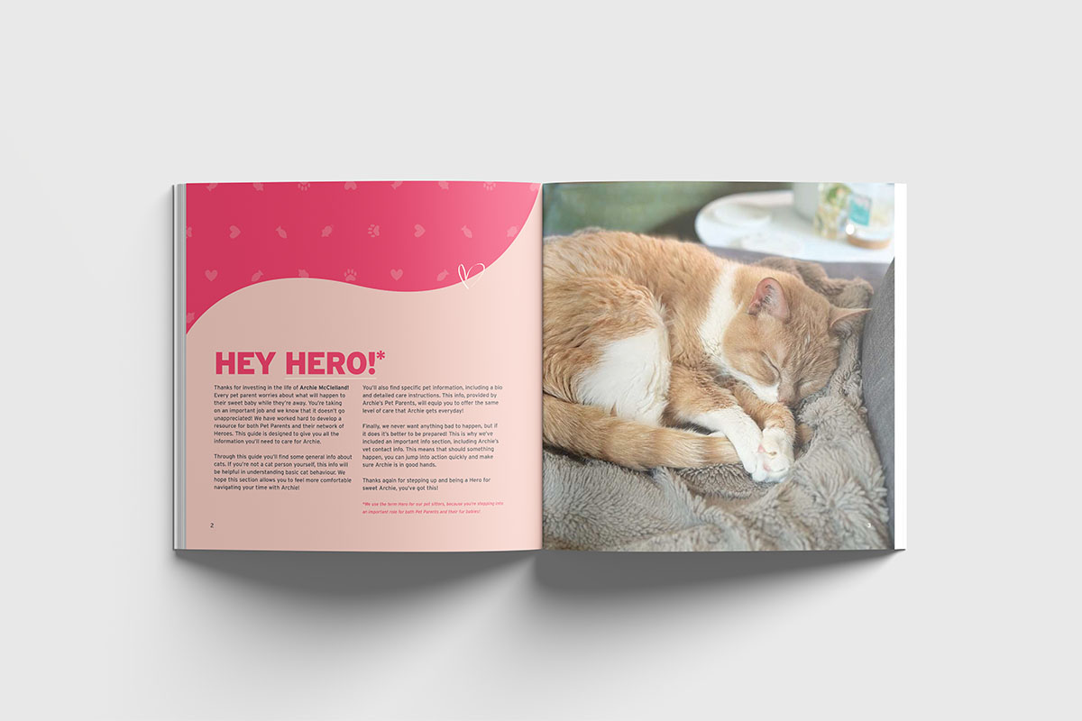
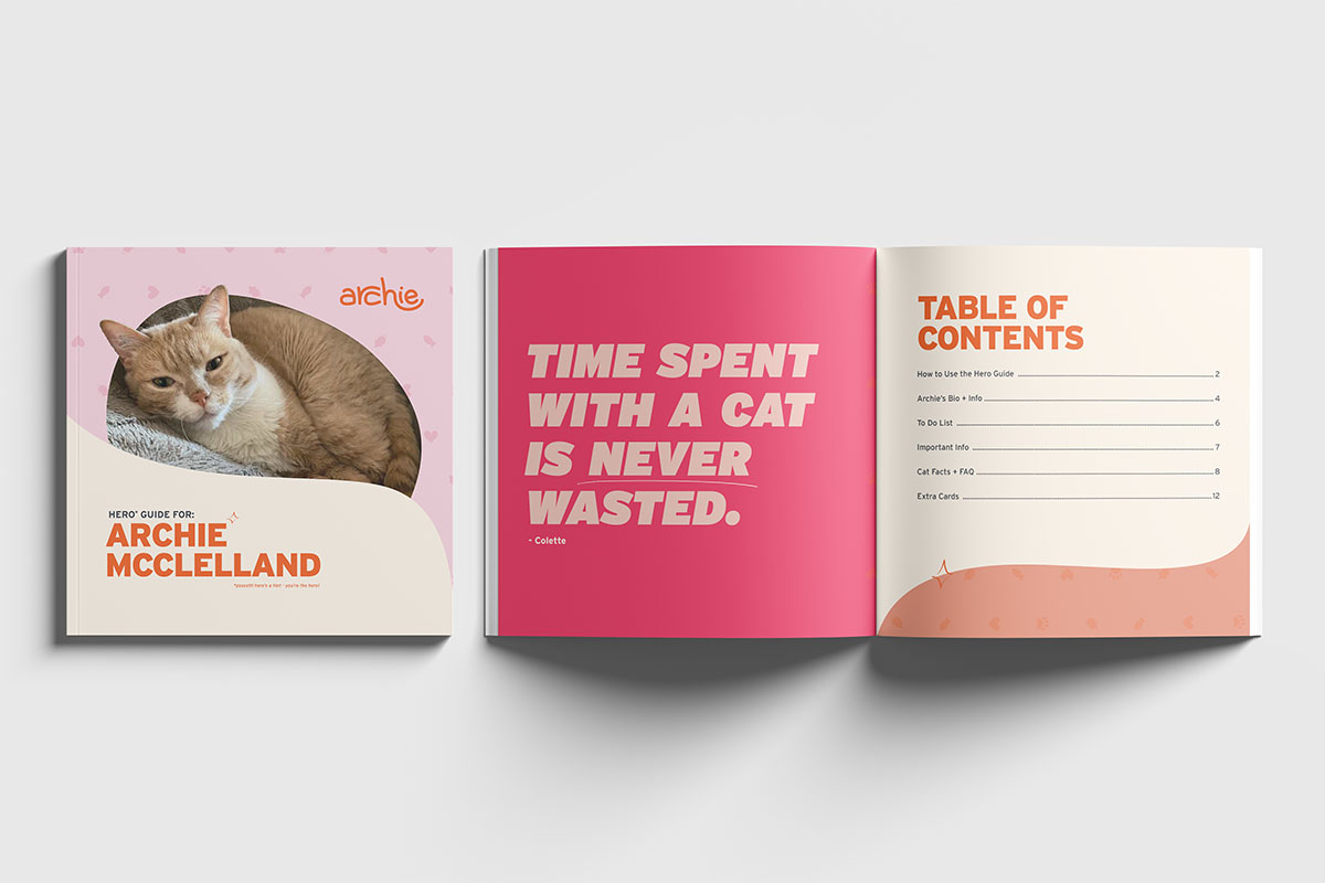
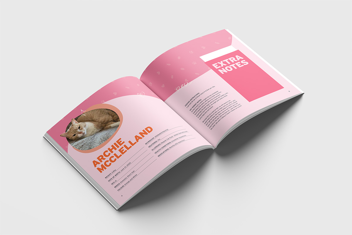
A companion print publication provides an analog resource for situations where a Hero is not tech savvy or prefers a printed resource.
User Flow
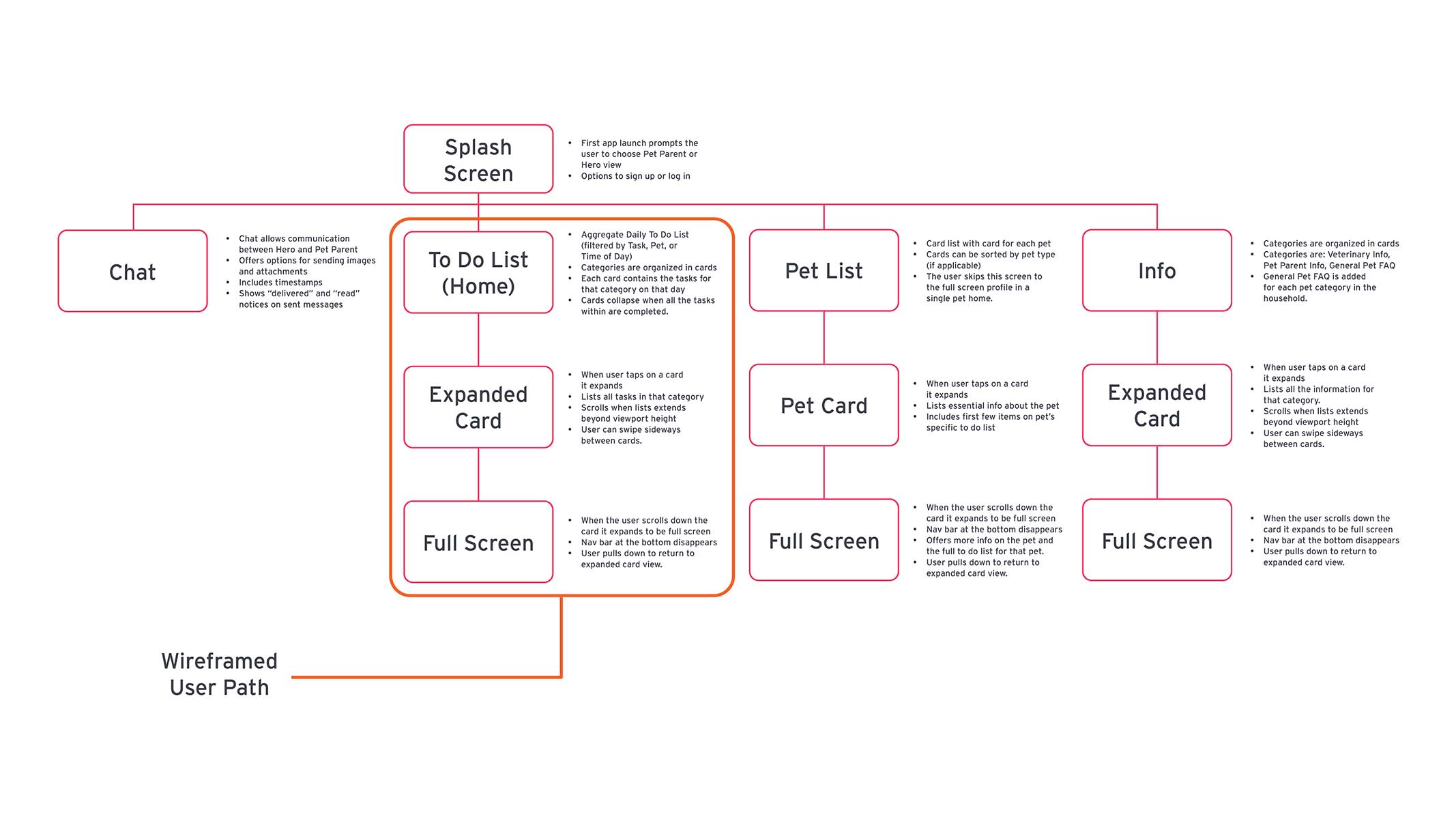
The Archie app uses a repeating card structure for the Task List, Pet List, and Info. Each of these paths displays initially in a condensed card and then expands to a larger card and finally to a full screen view.
The chat feature would follow a standard messaging structure but is housed natively so that users can make use of wifi or data plans to communicate with each other.
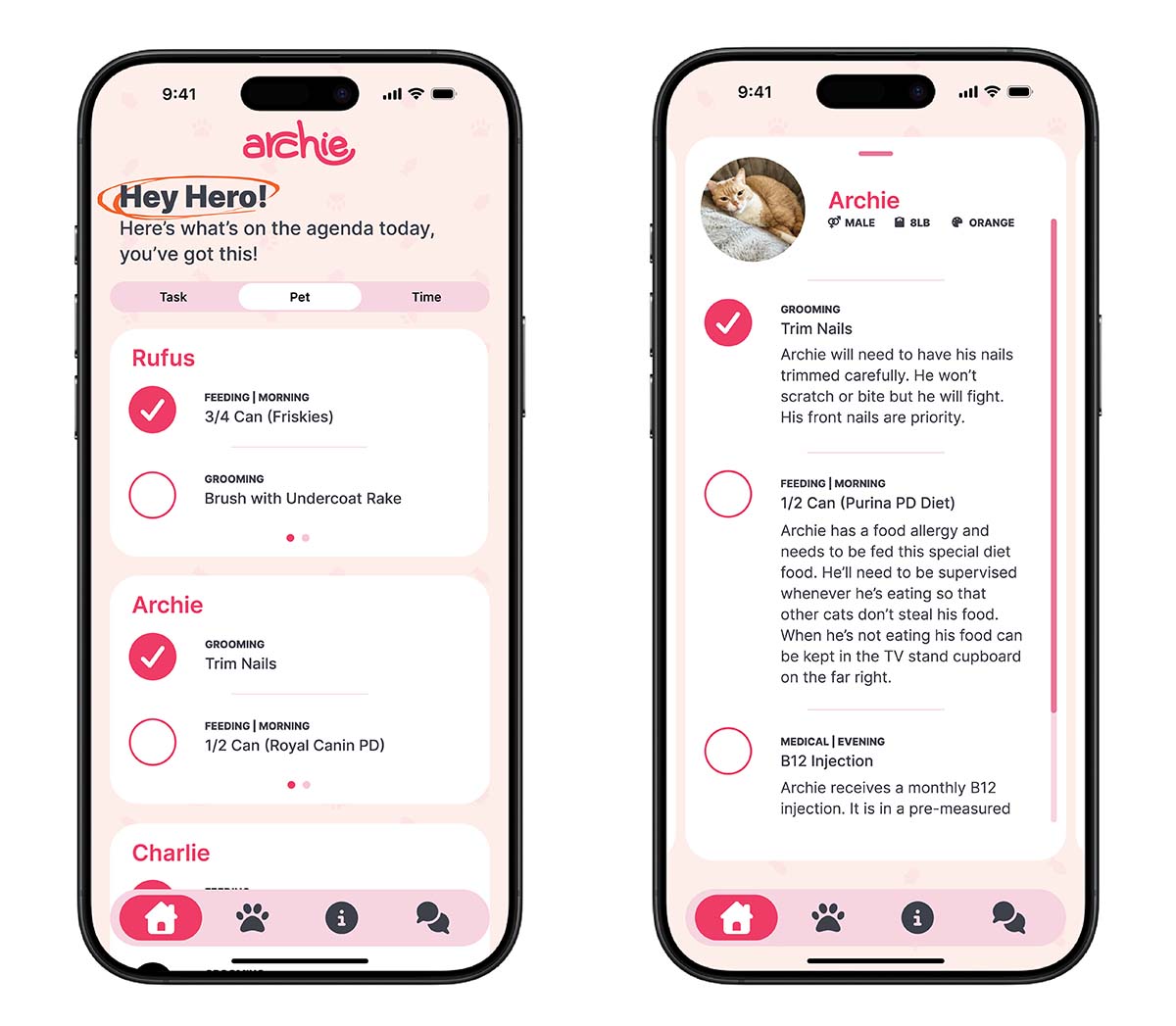
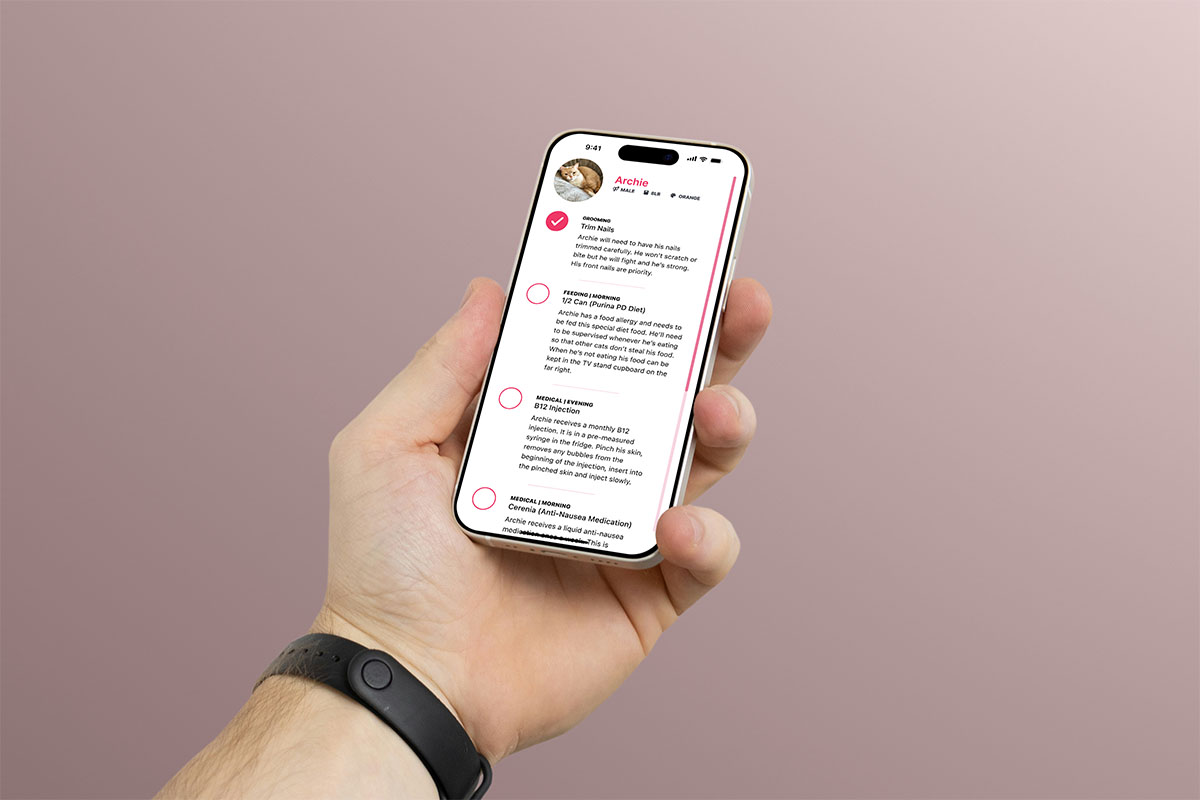
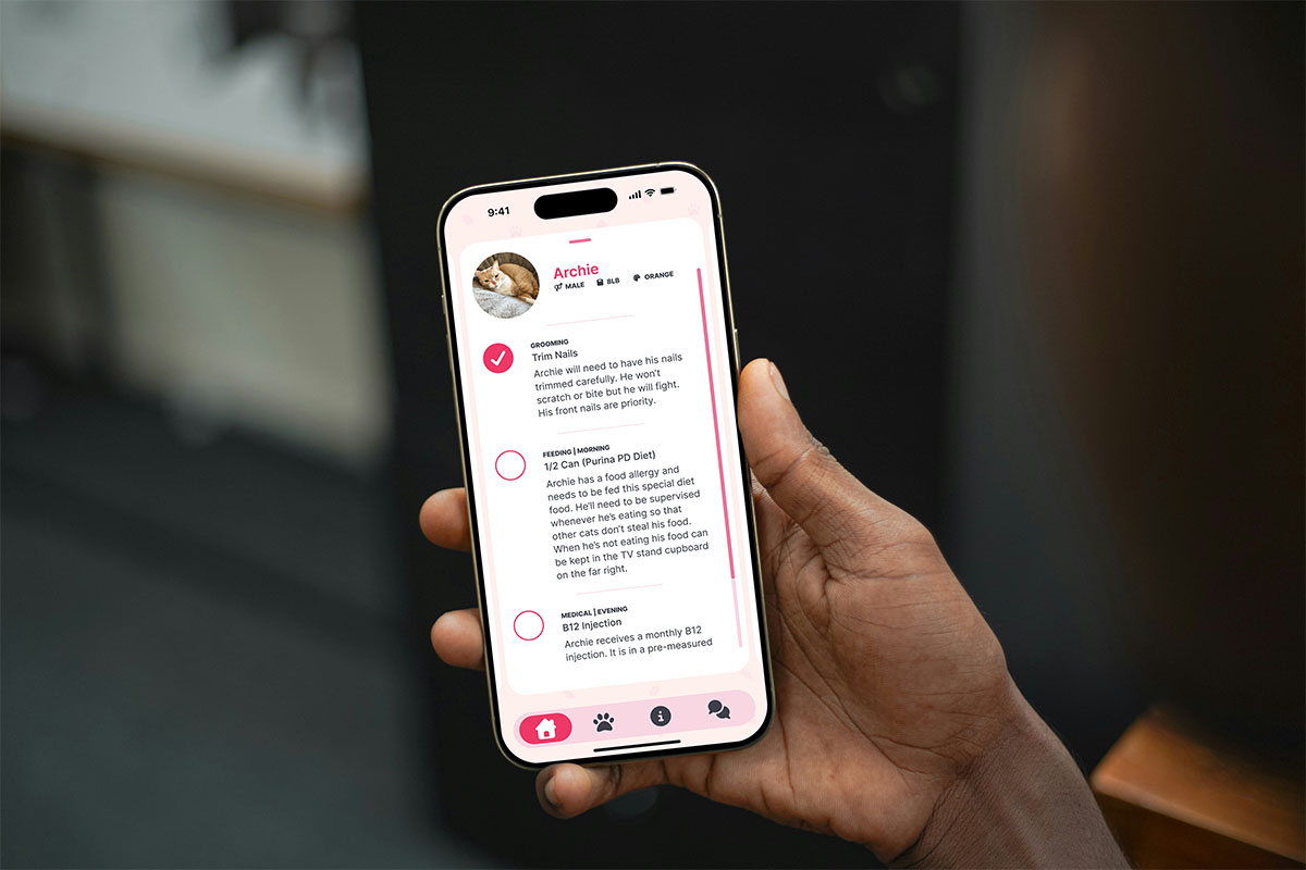
When the user taps an individual card, it expands and the other cards move into a horizontal orientation.
A grabber at the top of the card shows that the user can pull down to return to the regular card view.
Scroll bar on the side indicates the user can scroll in the card and shows progress through the card.
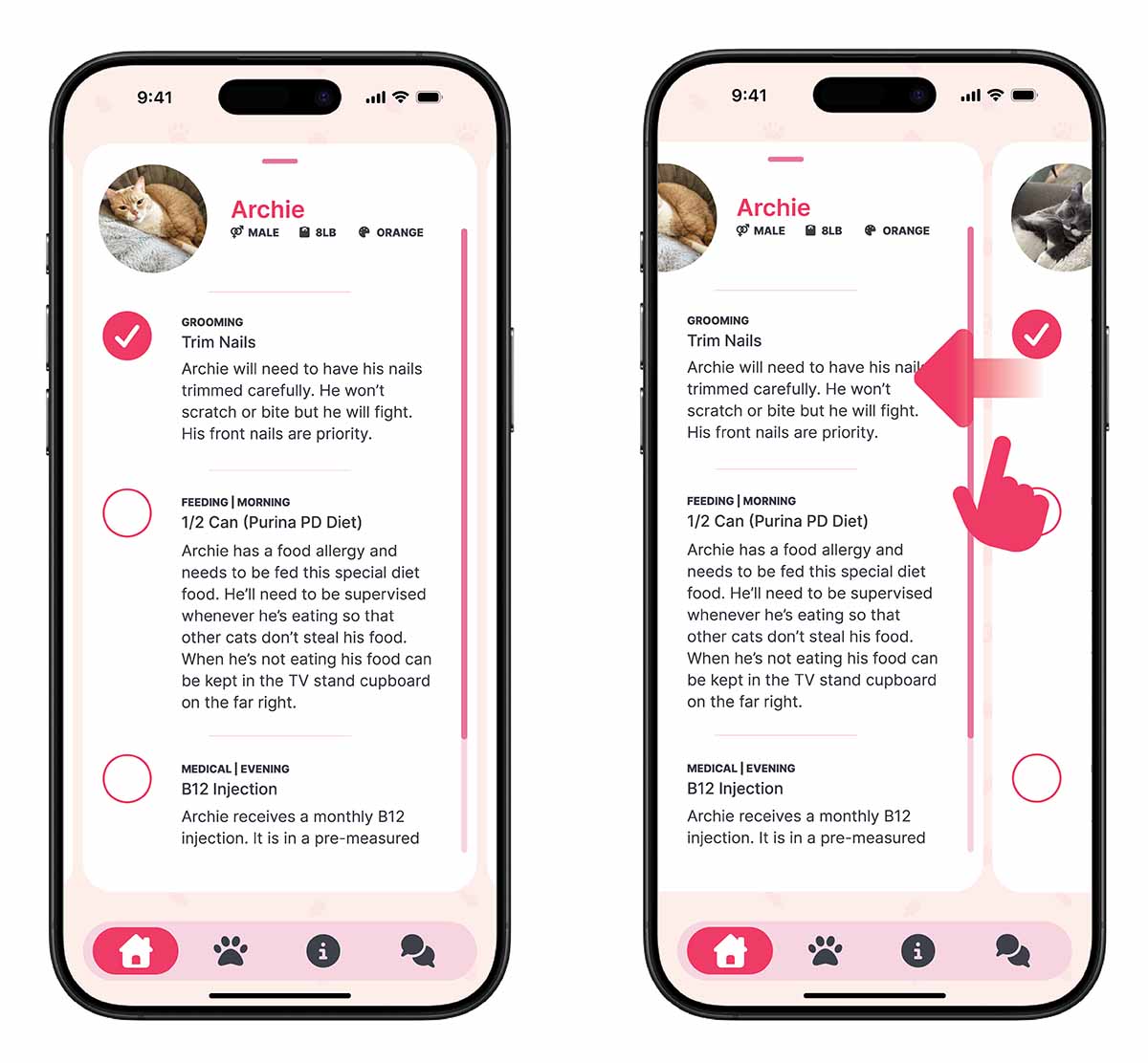
In the expanded card format, individual cards transition to a horizontal arrangement. This allows the user to swipe side to side to switch between expanded cards.
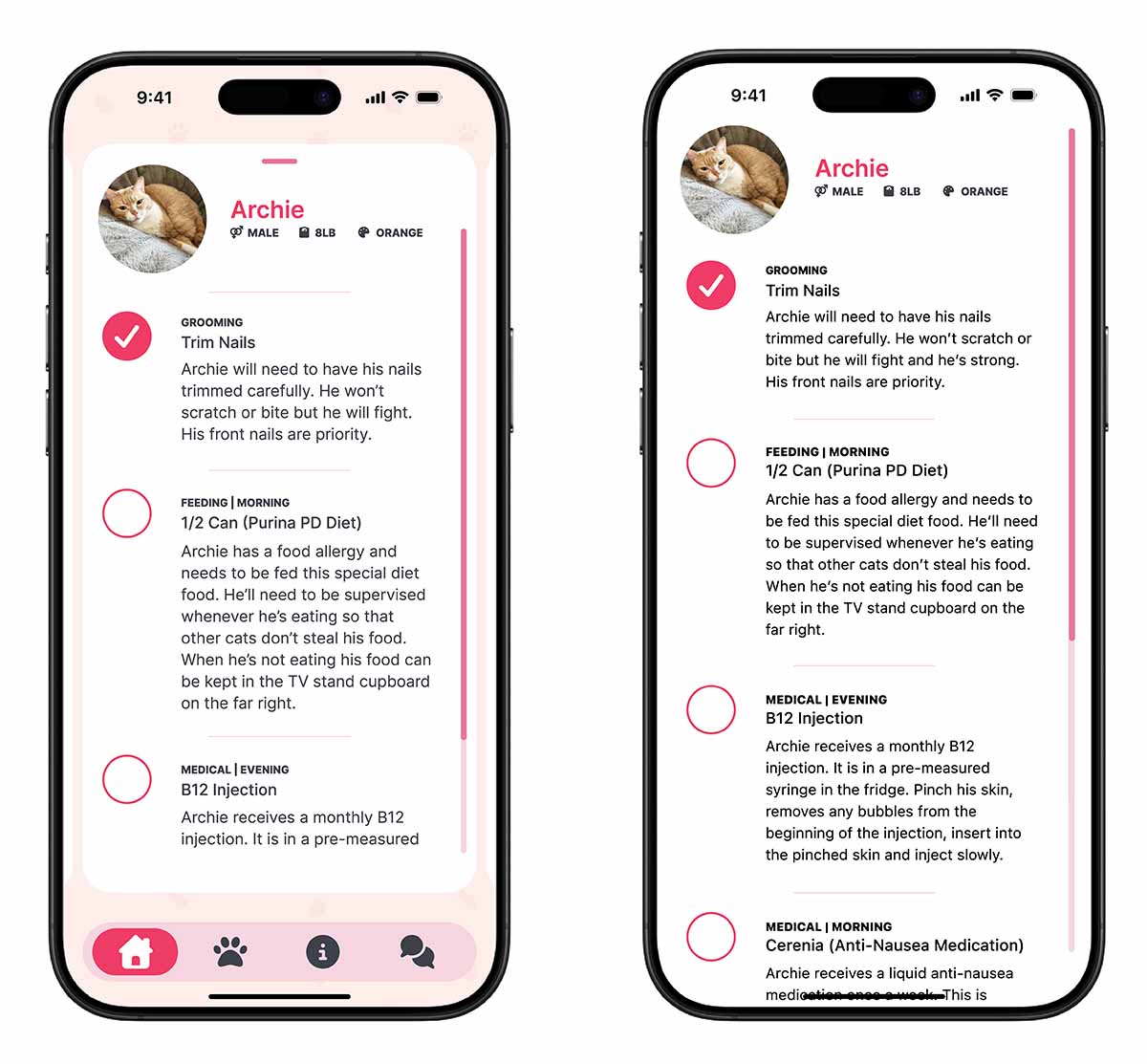
When the user scrolls up on the expanded card it grows to a full screen view. The nav bar at the bottom disappears.
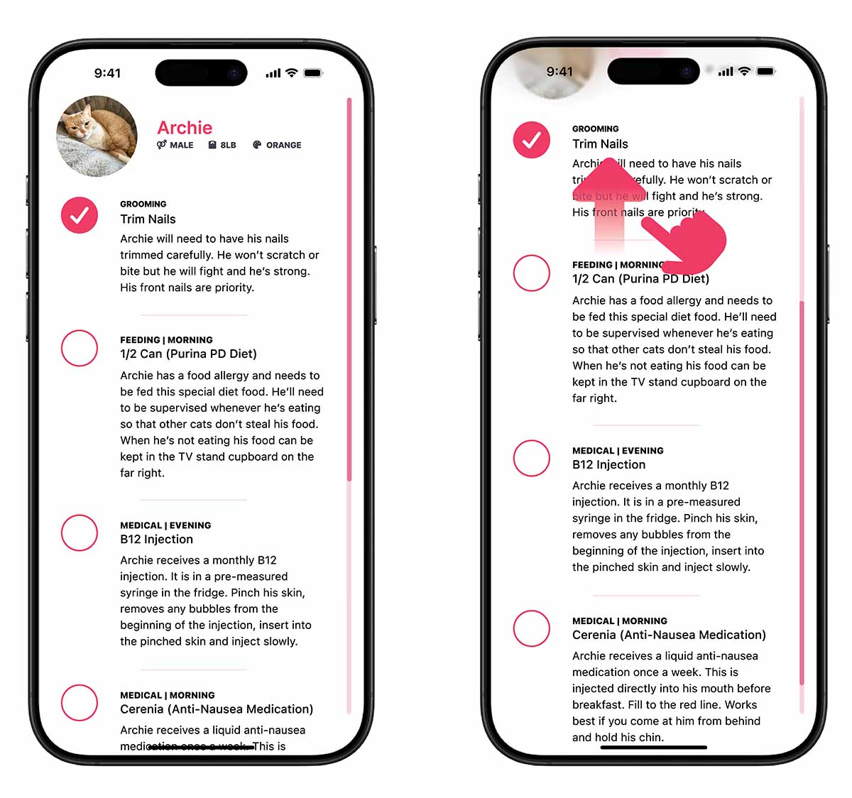
Once entering full screen mode, the user can continue scrolling up to reveal more content that was below the viewport height.
A filter at the top of the screen blurs content as it runs behind the status bar at the top of the screen.
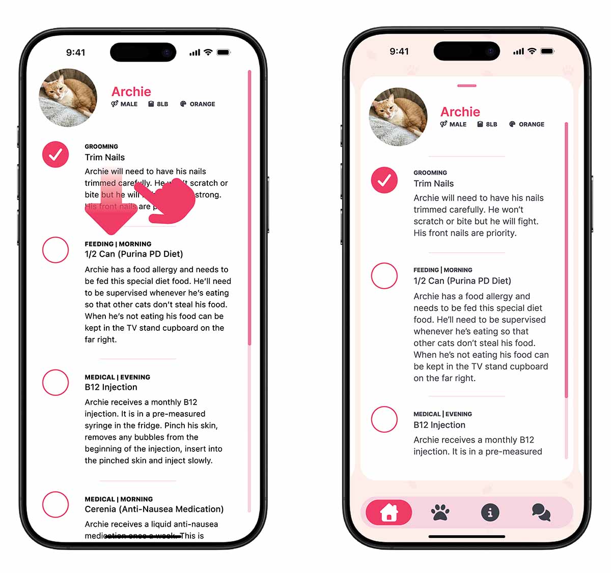
The user can exit full screen mode by scrolling to the top and pulling down. This returns to the expanded card format.
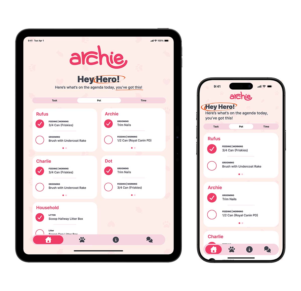
The tablet version makes use of the viewport width to reflow cards into a two column grid.
Mockups