CAMPAIGN DESIGN
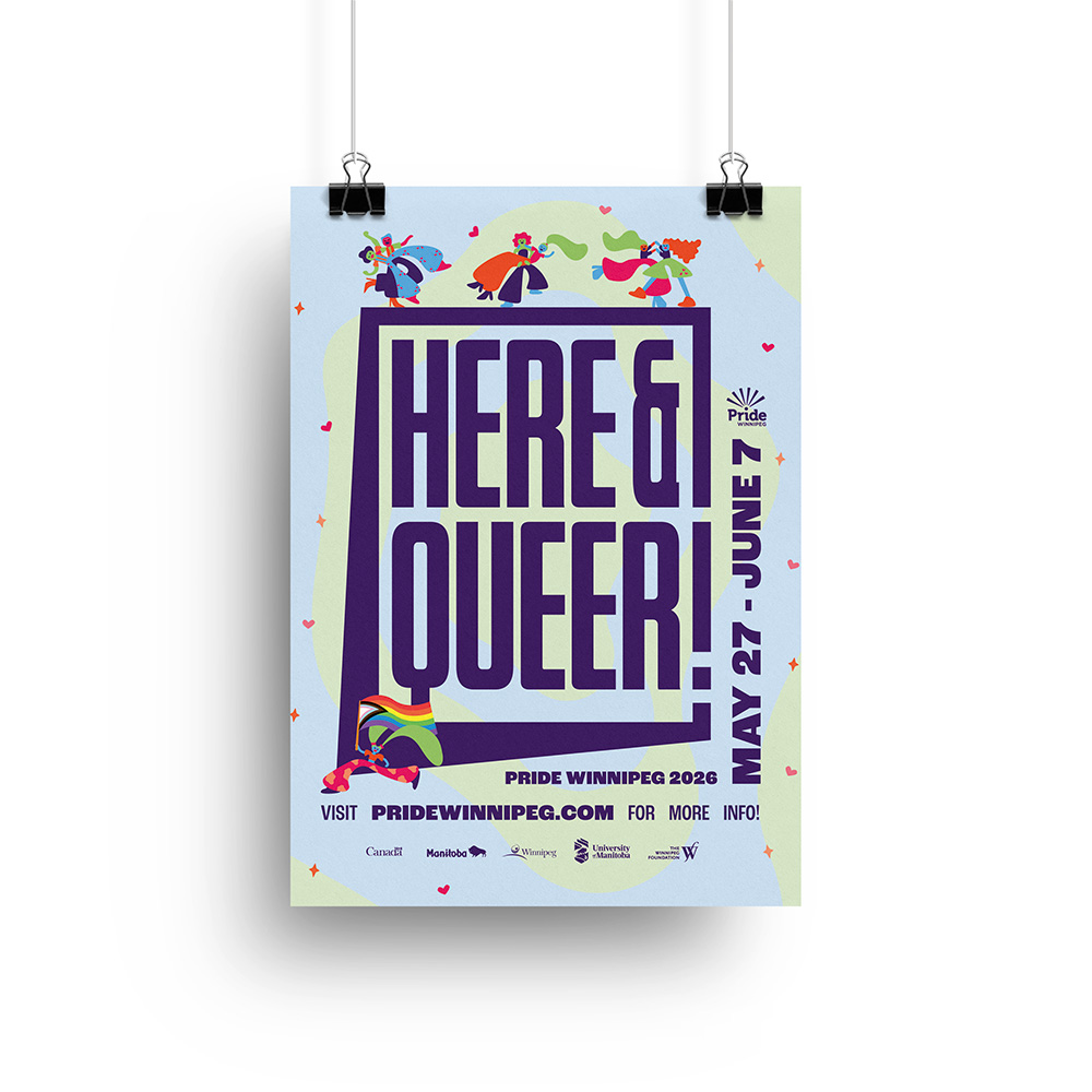
Pride Winnipeg Theme: Here & Queer
This theme for Pride Winnipeg is inspired by the 90's queer liberation slogan "We're here, we're queer and we ain't going nowhere!" In the 1990's the queer community was fighting for marriage equality, anti-discrimination legislation, and better funding for HIV/AIDS research and treatments. Pride wasn't just a fun party, it was a protest.
In a time when the rights of 2SLGBTQ+ people around the world are regressing, and public support for the queer community slips, the return to a more protest centred theme for pride aligns well with the current situation facing queer folks.
Project Assets
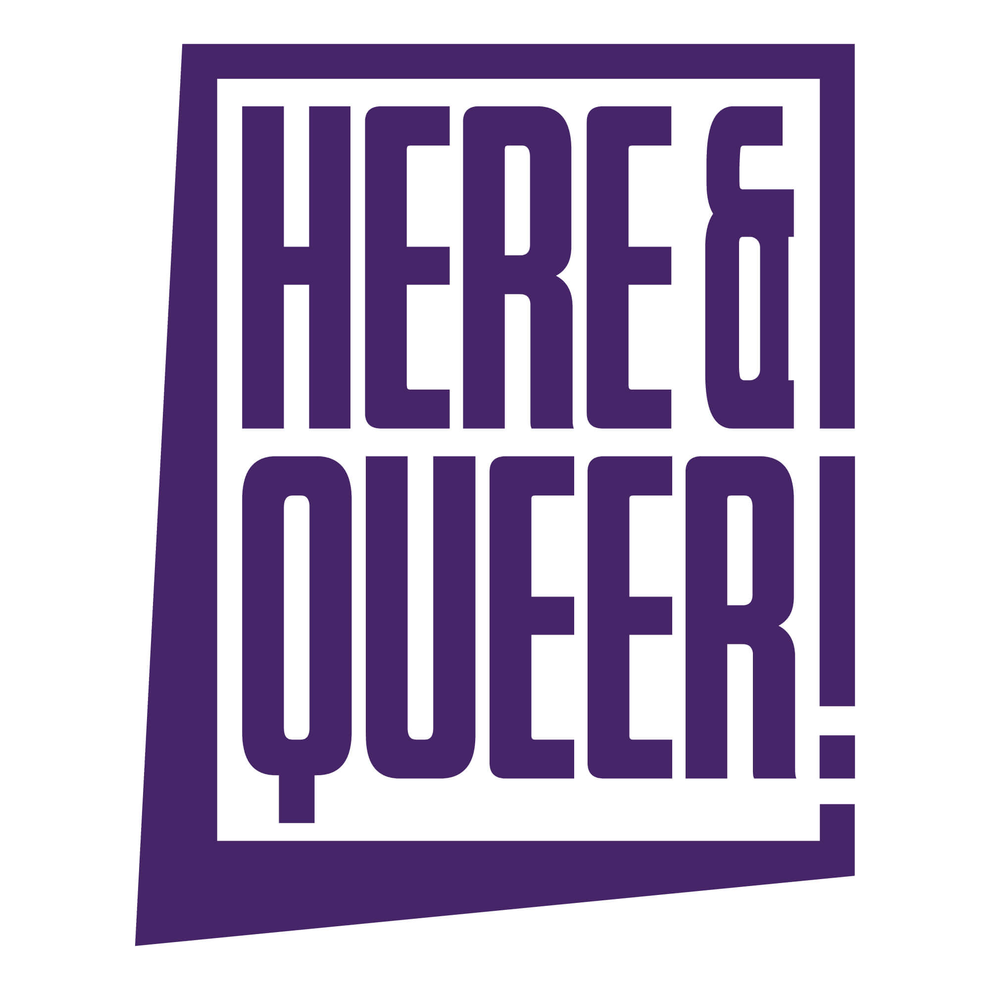
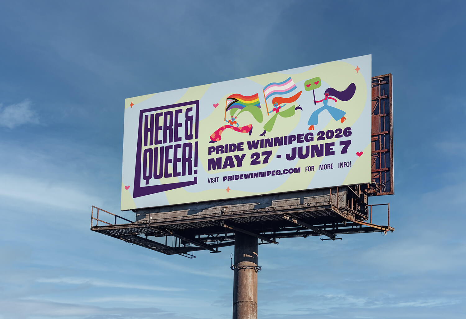
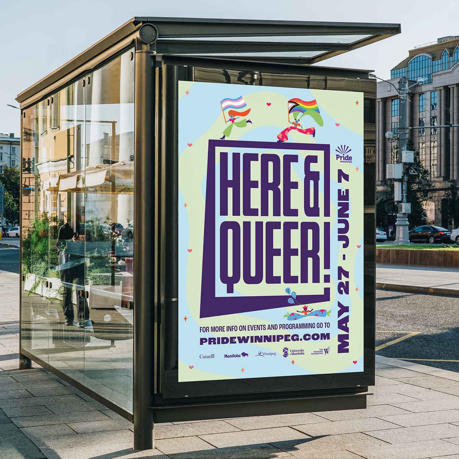
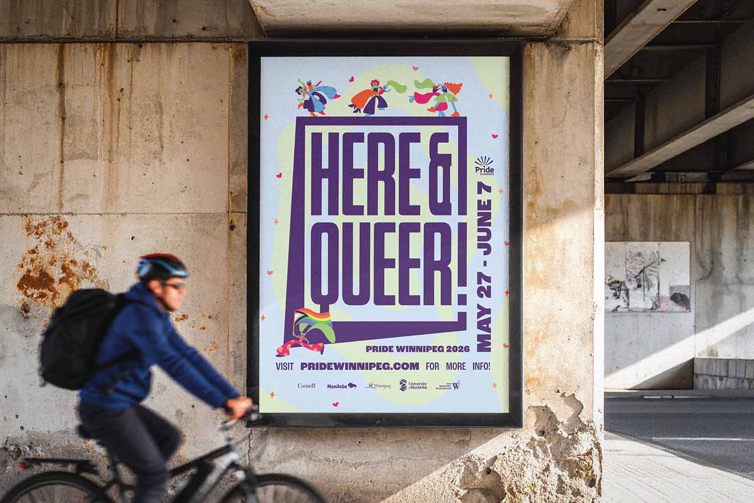
Inspired by the protest part of the Queer Liberation movement, the logo makes use of condensed tall letters, giving a sense of strength and urgency.
A large frame, with the same width as the letterform strokes, encompasses the text to create a further visual connection to a protest sign. The exclamation mark integrates into the edge of the frame to further connect the theme.
Finally, the outer bottom left corner is pulled out and down to further reference a protest sign.
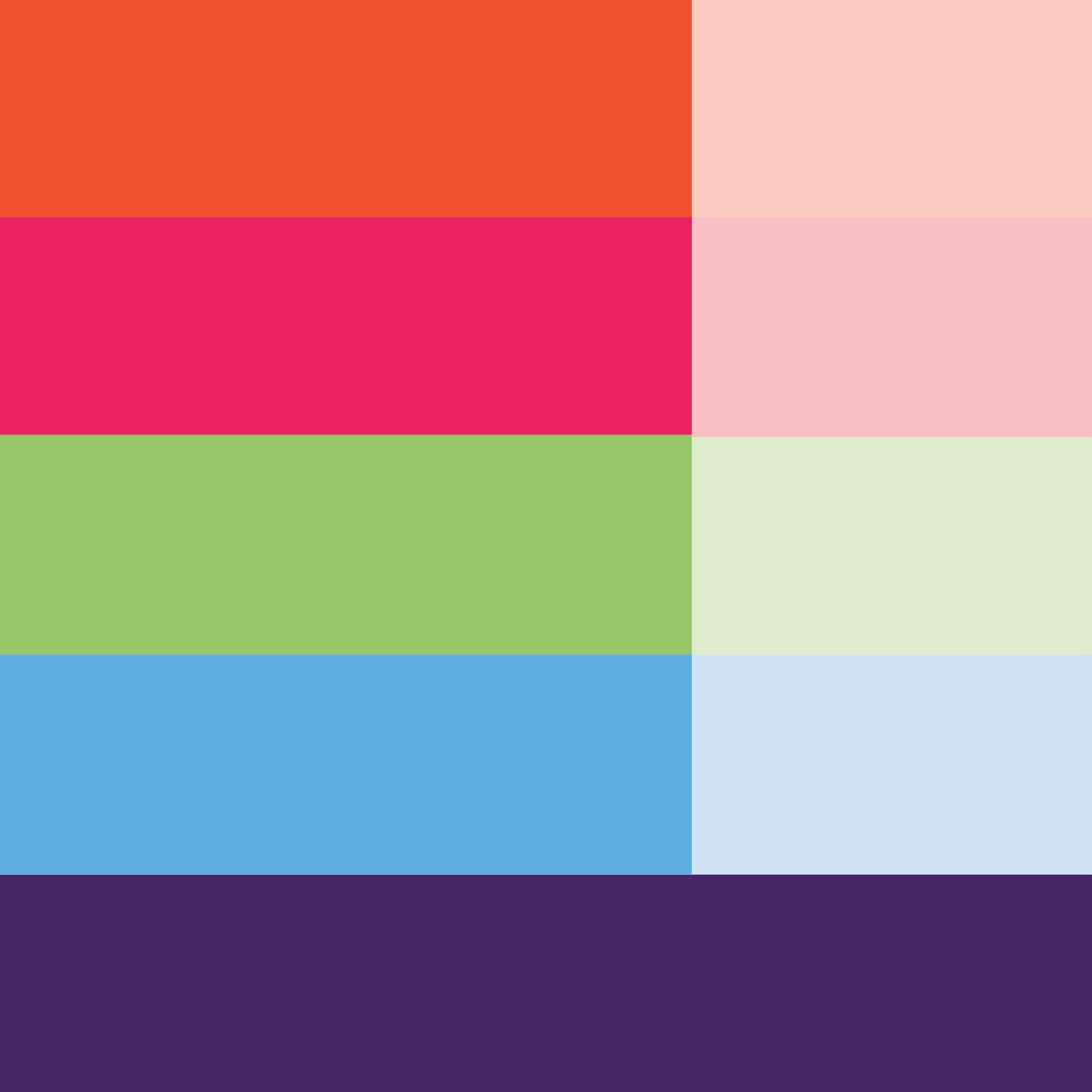
The colour palette is informed by the pride flag, but uses a reduced palette making use of 5 bright colours. The first 4 are reduced 30% when used as a background colour.
These colours offer a bright palette that communicates the vibrancy of Pride, while not getting lost in the cliche pride colour palette.
The dark purple is used for text throughout the design, unless contrast requires a light text on dark background - in which case white is used.
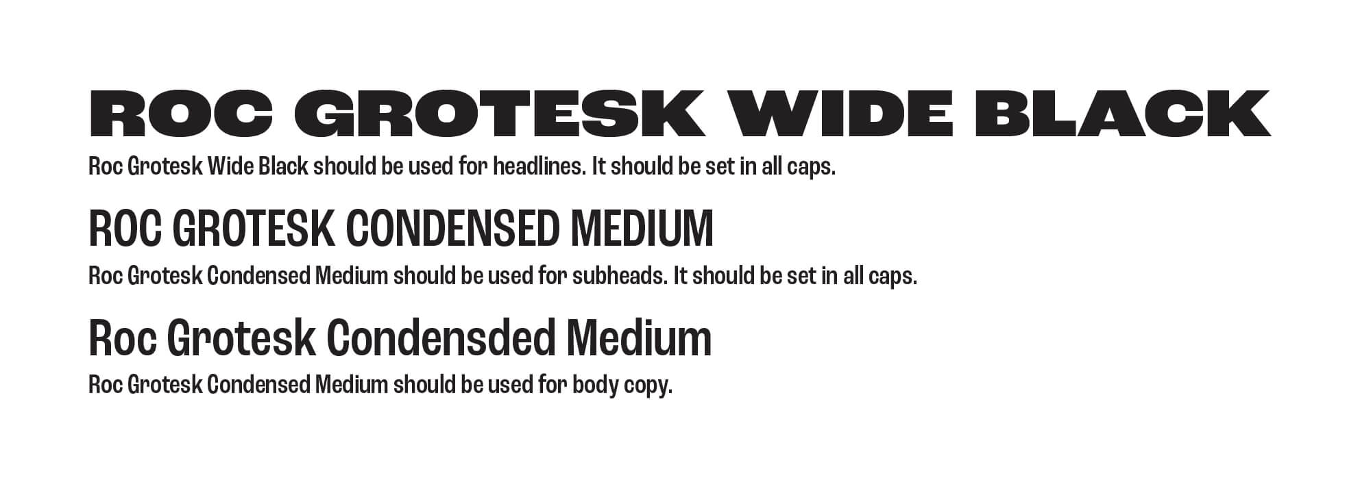
Roc Grotesk is the font used throughout the campaign. It's varieable widths allows for lots of different type styles. It complements the logo type but doesn't match it exactly.

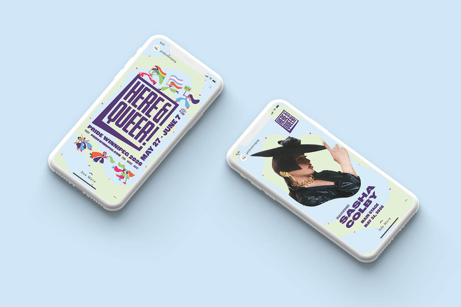
A blob shape is used throughout the campaign as a container shape for images, repeated to create a background pattern, or as another visual asset for content.
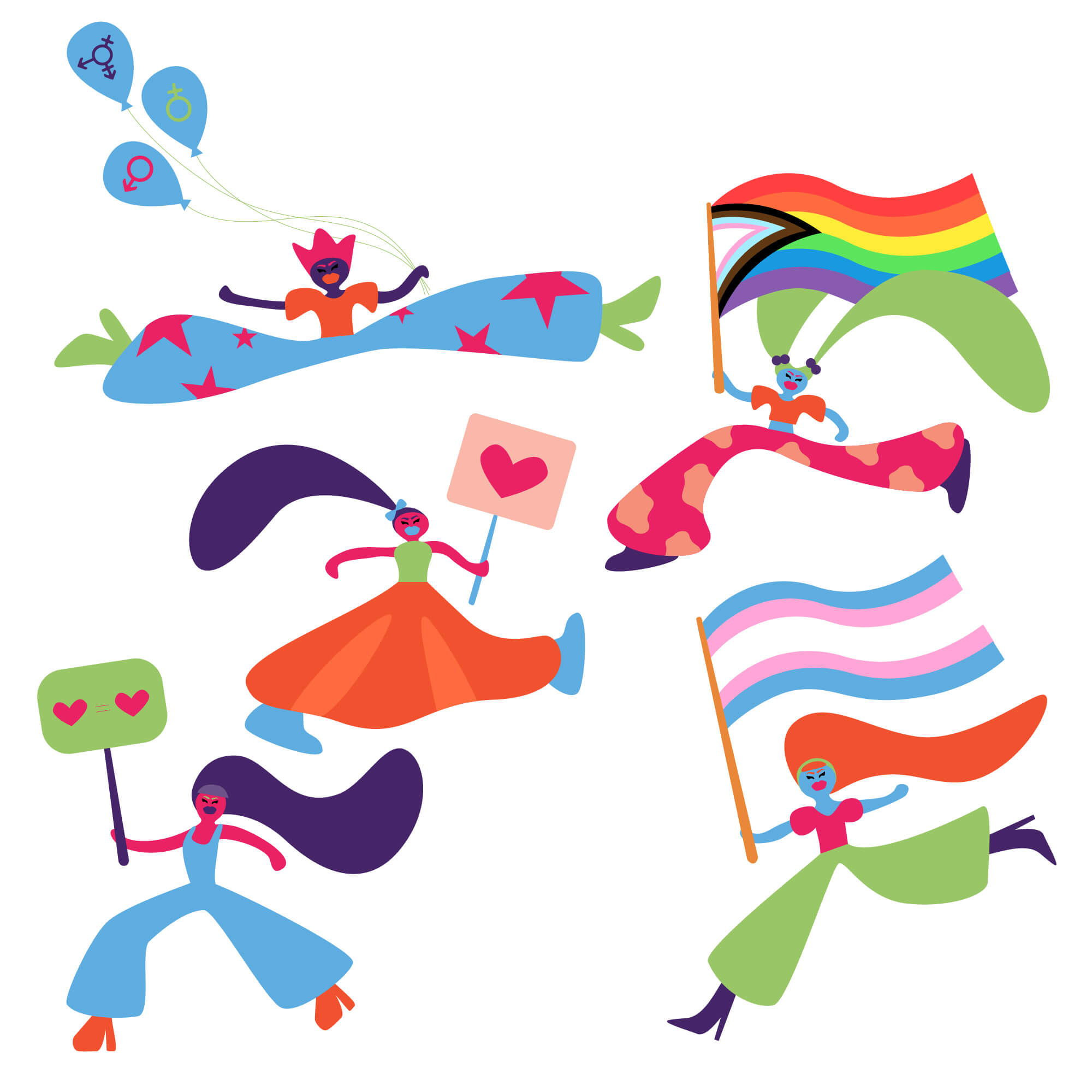
A collection of illustrated characters were created to represent the protest movement led by queer people. They carry different symbols that are connected with the queer liberation movement: flags, signs and other ways of indicating "Here & Queer!"
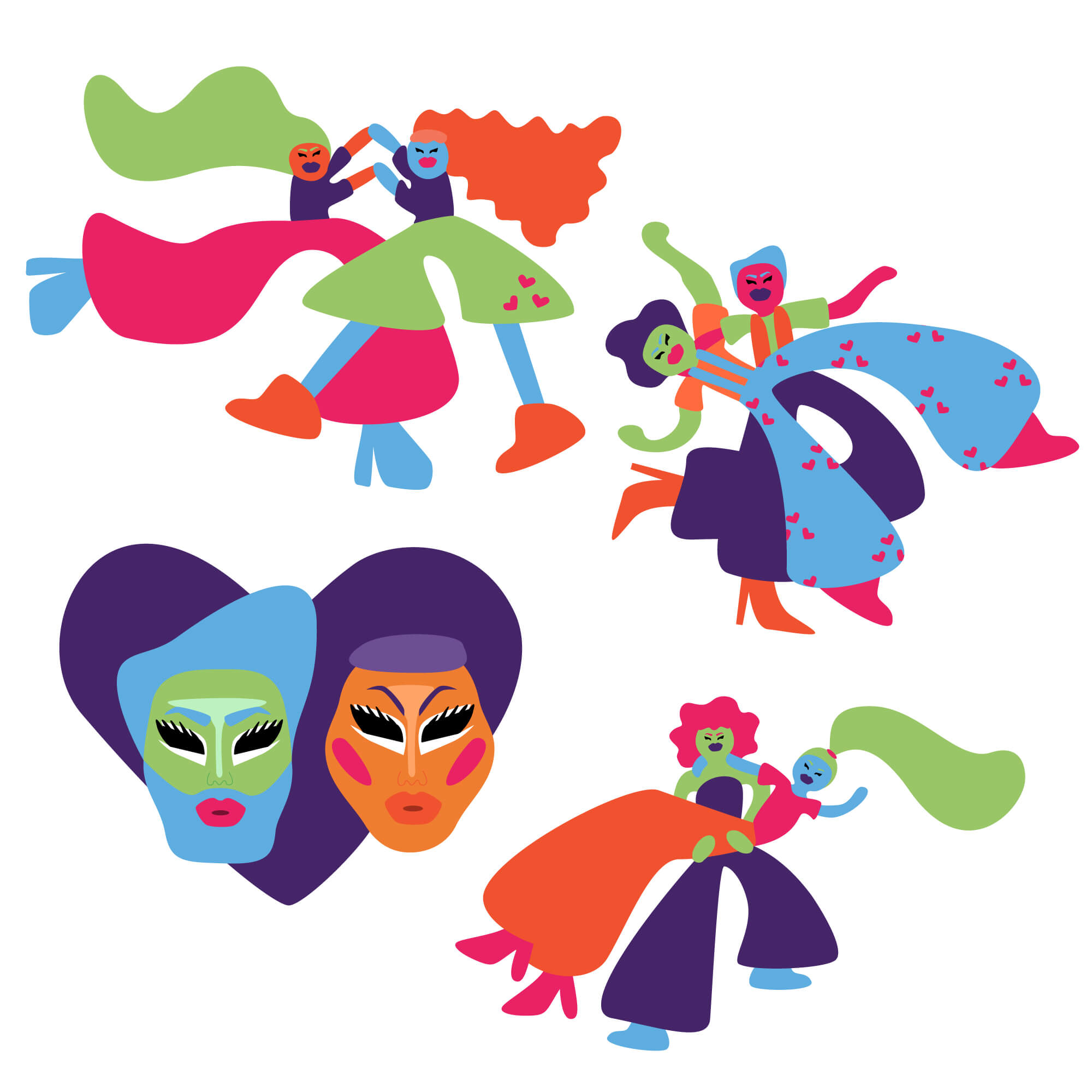
A collection of illustrated characters were created to represent the identities and sexualities that collectively create the 2SLGBTQ community. They centre around a large drag queen/drag king heads that represent the importance of drag within the community.
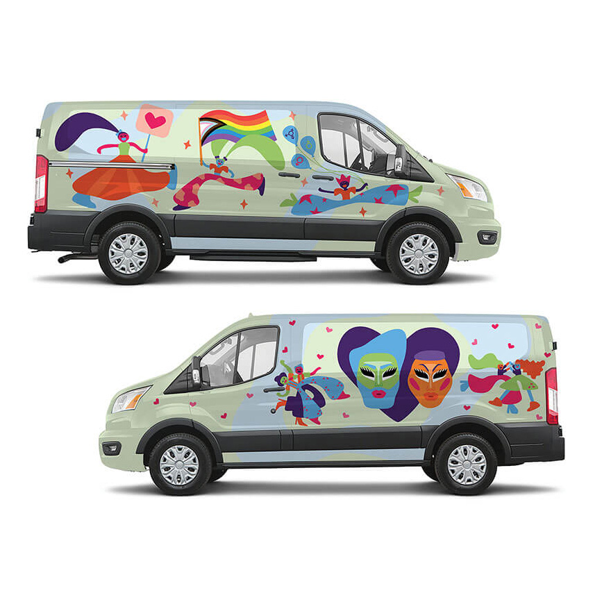
A keystone expression of this campaign is a collaboration between Pride Winnipeg and Peg City Car Coop
One of the passenger vans that Peg City offers for rent would be wrapped and marketed as the Pride Van. In the lead up to Pride it would serve as an advertisement for Pride, and function as part of Peg City Car Coop's Pride group!
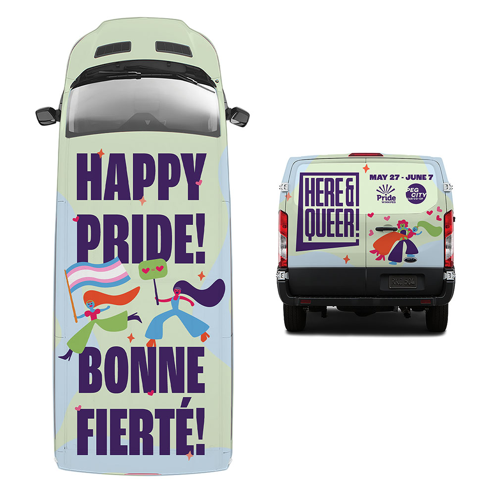
Since the majority of Peg City Car Coop vehicles are located in the centre of Winnipeg, the van wrap would make use of the tall buildings and bridges by using the roof space to wish viewers a Happy Pride/ Bonne Fierte!
This treatment also maximizes drone footage and photography that is captured during the parade.
The back of the van, viewed the longest by those behind in traffic, functions as an ad for Pride Week.
Campaign Expressions